Poplar Go
Enabling Poplar haulers with intuitive designs to reduce landfill
Team
5 Designers Total
Context
Client Project
Timeline
2.5 Weeks
Google Sheets Figma Maze
Tools
UX Research Strategy UI Design (Map Screens) Design Studio
My Role
Overview
Context
Designing an iOS mobile app to assist Poplar haulers
This case study focuses on the journey a Poplar hauler goes through to complete their daily work orders and to create an application that allows them to document their process.
Background
Through Poplar's innovative food waste removal system, they make sustainable living easy by reducing climate change
Poplar is a full loop system that collects its customers’ waste and tracks its carbon footprint. Poplar partners with haulers across the nation to help swap out their customers’ food waste bins and take them to facilities for composting, as well as providing other services to customers.
Haulers Problem
Difficulty finding and managing customers’ tasks for the day
Currently, haulers are using excel sheets and Google Maps to find information on each customer’s required service and where to locate them. Due to the current unorganized system, it’s difficult for haulers to find and manage all their customers’ tasks for the day.
Design Solution
Create an app for haulers to use on their daily routes
Create an app for drivers to use when they are going on their routes to complete their pickup/delivery tasks for the day.
Desired App Functions
UX Process
Getting Started
Interview & understand driver app comparators
In the research phase of this project, we gathered and conducted a wide range of research, but we’ll focus on the user interviews, affinity mapping & user flows for the most revealing insights.
Since a majority of the research was supplied to us by Poplar, & they have no real direct competitors, we began by interviewing a few people working for their comparators. We strategically crafted questions for our target participants to understand their experiences working with a driving-based app. We decided to have 5 user interviews with people that drive for delivery services such as Uber, Doordash, Lyft, and Amazon Flex.
Discoveries
Key Findings
Patterns emerge through interviewee’s
What Haulers Need in an App
Efficiency, Optimization, Notifications
Haulers need an all-in-one way to view their task information, view their optimized routes, and notify customers of their service orders, so they can efficiently complete all of their assigned pickup and delivery tasks for the day.
User Persona
User Flow
Comparator Analysis
Analyzing comparators for key features
We decided to analyze various comparators in order to create an effective design and understand what features we should incorporate. The comparators we examined were Detrack, WooDelivery Driver, Trucker Path App, Amazon Flex, Coolfire Core, and Uber Driver.
Comparator Insights
Seven comparator insights revealed
Task management on the home page/dashboard
Current, upcoming, and pending view at the top with tasks
Progress bar or some sort of indicator that shows the status
Telling drivers where they need to be and when
Easy way to contact administration about issues or concerns
Opportunity to upload a photo for proof of delivery
Opportunity for the driver to leave notes
Feature Prioritization
Ideation
Design Sketches
App Map

Iterative Frames
Route Screen
Map Screen
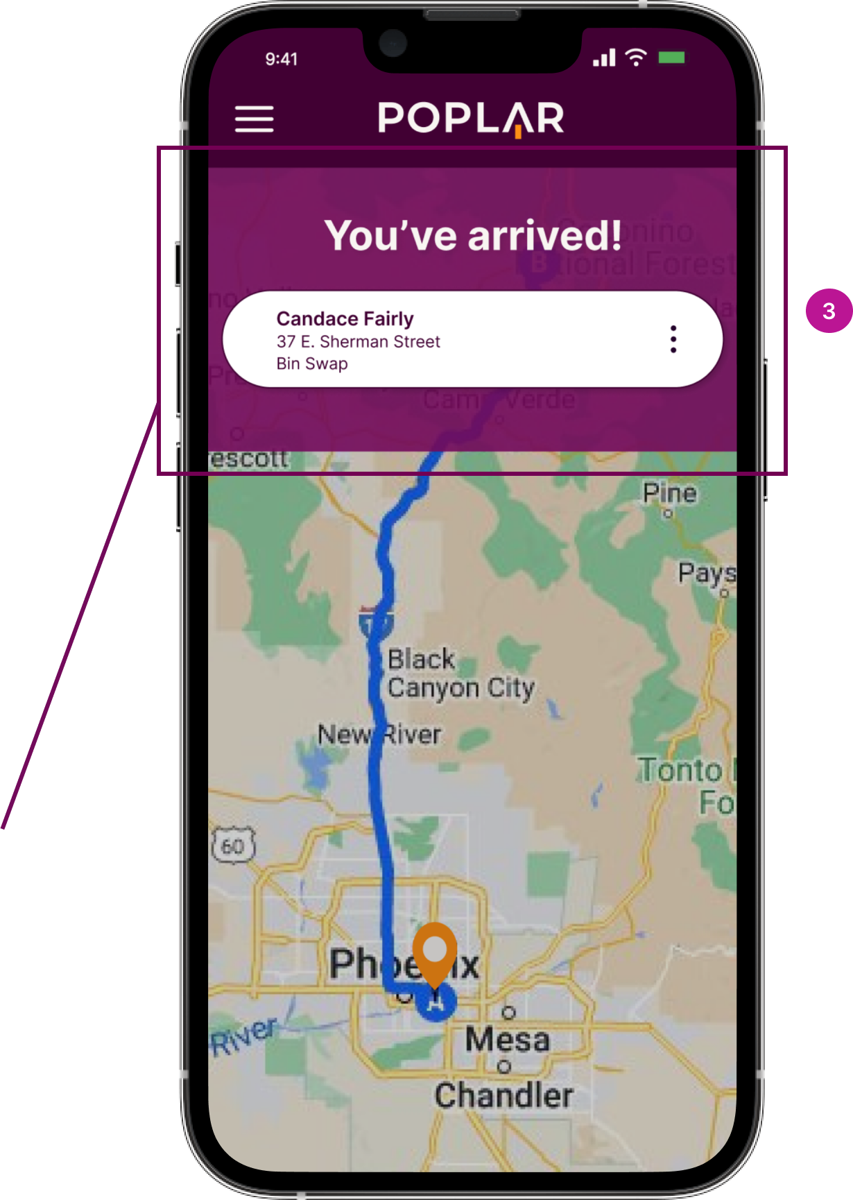
Arrival Screen
Measuring Impact
Usability Testing
Testing our design through six usability tasks
Iterations
Insights from Users
Users need more clarification on task buttons
"All of the steps were easy to understand and complete. However, the only issue I had was with the 'complete' and 'incomplete' buttons. I was unsure if the photo and weight should be uploaded before I filled out that the job could not be completed."
Next Steps
Future Iterations
In the future, we would like to have the app accommodate other phone screens & modes of transportation. We want to create thorough flows demonstrating the driver's capability to report and contact administration. Lastly, we would like to conduct more moderated usability tests to understand the thought process behind a user’s click.


